Contact us
First Floor, 159 Victoria Pde
Collingwood, VIC 3066
(Google Map)
1300 727 952
or
+61 3 9910 4099
Victoria’s first govCMS site is live
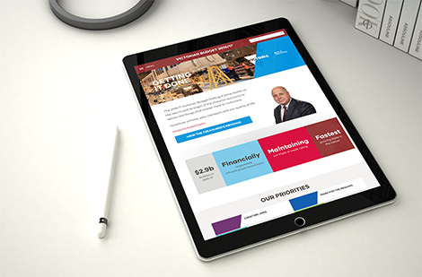
Today on behalf of the Treasurer, Salsa Digital and the Department of Premier and Cabinet (DPC) launched the new State Budget website, Victoria’s first govCMS website.
State budget site launches
At 1pm today, DPC launched a new site for the Victorian State Budget on behalf of the Department of Treasury and Finance (DTF). As Victoria’s first govCMS website, this marks an exciting step for Salsa Digital and govCMS.
It’s also a fantastic, citizen-focused move for the DTF, which had traditionally delivered the budget information as PDFs on the existing DTF site.
However, with so many users accessing information from tablets and devices, this format was outdated. In addition, the old budget web pages didn’t guide citizens to the parts of the budget that affected them, and while other state government sites are more interactive and citizen-centric, the Victorian budget site was the only state site that didn’t support specific geographic overlay to budget data.
More citizen-centric outcomes demanded a different approach — and so the DPC decided to put all the budget information into an interactive website to provide a more modern, citizen-centric delivery of critical budget information.
Opportunity to trial
As a ‘campaign’ based website, the Victorian State Budget was an ideal opportunity for the DPC to ‘test drive’ govCMS. The project would be a self-contained ‘mini’ site — well, actually a big mini site!
The brief
The first part of the brief was important…the time frame. Salsa only had seven weeks to get the site up and running, ready for the 1pm launch. But we’re used to tight timeframes at Salsa :)
Probably the most challenging thing about this website was the high risks around going live. Key areas of sensitivity included:
-
Time sensitive — needed to go live at precisely 1pm to align with the Premier’s announcement.
-
Data sensitive — budget data couldn’t be accessible in the cloud until one hour before go-live. The actual data was ‘embargoed’ on a physical server in a secret location only accessible by authorised personnel (again until one hour before go-live).
-
Data quality — data needed to be accurate. Having the wrong budget data risks misleading Victorian citizens and would be detrimental to DPC’s reputation.
-
Sequence sensitive — Salsa had identified several potential points of failure given the many dependencies. These all needed to be managed closely.
Project delivery
The new budget website needed to make information more accessible to citizens. It had to be easier to access, easier to understand and easier to make the connection about how the budget would impact their lives personally, in their region.
Project methodology
With such a tight timeframe, agile project methodology was the only way to go. It allowed Salsa and DPC, with great support from Acquia and the Federal Department of Finance, to work quickly and effectively, while also reducing risks. It was also a pleasure to have a client that was focused, intensely engaged and not afraid to make quick and strong decisions on an MVP (minimum viable product).
Design and engineering
The DPC wanted to leverage existing design elements from its Regional Victoria website. This helped with the tight timeframes but also DPC’s design approach of creating an evolving design framework as a foundation for future websites. Salsa was delighted to add to the compelling DPC design with a handful of refinements and usability enhancements with the citizen’s experience front of mind. The result is a design that’s on brand, citizen-focused and looks great, even if we do say so ourselves :)
Key website features are:
-
Improved pathways — so users can find out how the budget benefits/impacts them personally.
-
Increased interactivity — use of interactive maps so people can locate their region quickly and easily and identify what budget initiatives impact their area.
-
Data visualisations — using visual graphs to quickly and easily convey budget statistics (‘a picture says a thousand words’) .
-
Accessible — content has been designed to be WCAG 2.0 AA compliant so people of varying cognitive abilities can still access it (e.g. using screen readers).
-
Responsive — content can be read on tablets and mobiles as well as desktop computers.
-
Dynamic menu — dynamic, engaging and intuitive menu system (mobile friendly) to improve pathways to budget project data.
-
Project profile pages — key information on each specific budget initiative.
The outcomes
Using govCMS and Salsa Digital’s experience with this CMS, the DPC has been able to deliver improved content and accessibility to Victorian residents. The Victorian State Budget website follows user-centric best practices, while also giving DPC all the benefits of the robust, open-source govCMS solution.
Now users can easily access budget information and see how it will affect them.
For DPC, govCMS gave them a great head start by using a CMS that has been designed specifically for government. It’s hosted on a solid, secure and resilient platform so the DPC could focus on content and creating a great digital experience for citizens.
The project has also allowed the DPC to effectively test drive govCMS on a smaller project, giving them an insight into its potential for becoming the baseline for the greater vision.
